Table of Contents
TogglePicking an exterior paint color is one of the highest-impact decisions a homeowner can make, yet it’s also one of the easiest to second-guess. The color you see on a paint swatch under fluorescent store lighting looks completely different when it hits your house at 2 p.m. on a sunny day or under the amber glow of evening. Add in architectural constraints, neighborhood aesthetics, and the fact that exterior paint is a 5–10 year commitment, and the stakes feel real. This guide walks you through the practical decision-making process: understanding how light shapes perception, matching your home’s bones, accounting for permanent fixtures, and testing before you commit a gallon to the wall.
Key Takeaways
- Lighting is the single biggest variable affecting how paint colors actually look on your house—test samples on all four sides at different times of day to account for north-facing cool light, afternoon warmth, and evening conditions.
- Your home’s architectural style should dictate paint color choices: traditional homes favor classic combinations like white with dark trim, while modern styles offer flexibility for bold colors like deep charcoal or terra cotta.
- Paint colors for house exterior must coordinate with permanent fixtures like your roof, foundation, and existing trim—warm-toned shingles work best with warm paint, while black metal roofs offer flexibility with nearly any body color.
- Climate significantly impacts color performance and maintenance: warm climates require lighter shades or UV-protective formulas, humid climates need mildew-resistant colors, and cold climates benefit from quality paint that flexes with freeze-thaw cycles.
- Always test paint colors with sample patches on actual walls for 3–5 days before committing—this $15–30 investment prevents costly mistakes and ensures your final color looks great in real light conditions.
Understand How Lighting Affects Your Paint Choice
Light is the single biggest variable in how a paint color actually looks on your house. The same gray that appears crisp and modern in north-facing morning light might read warm and dull in afternoon sun. The difference comes down to how UV rays and ambient light bounce off the paint film and your eye’s perception of undertones.
Test your color samples on all four sides of your house at different times of day. Morning light (typically cooler, more blue) reveals a color’s true undertones. Afternoon sun (warmer, more yellow) can brighten and shift cooler colors toward warmth. Overcast days show how the color appears in neutral conditions. Evening light often brings out warmer or cooler casts depending on your neighborhood’s ambient lighting (streetlights, surrounding homes).
North-facing walls receive consistent, cool light and show colors with less variation throughout the day. South-facing walls get intense afternoon sun and will appear brighter and warmer than the same color on a north side. East and west exposures bring dramatic shifts as the sun moves across the sky. If your house has varied light exposure (common for most homes), you may find that a single color reads too cool on one side and too warm on another. This is normal, pick the condition you see most often or during peak hours when people notice it.
Undertones matter more than you’d think. A “gray” might have blue, purple, green, or even pink undertones that only become obvious in certain light. Bring actual paint chips home, tape them to the wall (not in a window), and live with them for two or three days across different lighting conditions.
Work With Your Home’s Architectural Style
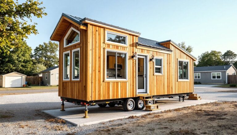
Your home’s bones dictate which colors feel authentic and which ones clash. A Colonial saltbox with brick chimneys and traditional trim has a completely different palette than a mid-century ranch or a modern farmhouse. Ignoring architectural context can result in a color that technically “works” but feels off.
Traditional homes (Colonial, Victorian, Cape Cod) typically favor classic combinations: white or cream bodies with darker trim, or muted earth tones like sage, taupe, or deep red. These styles have established proportions and details, think dentil molding, arched doorways, or defined soffits, that anchor color choices. Bold contemporary colors can feel jarring on these homes unless the home has already undergone a modern update.
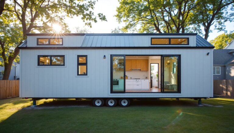
Modern and contemporary styles have more flexibility. These homes often feature clean lines, minimal trim, and large unbroken wall planes. You can go bold here, deep charcoal, true black, warm terra cotta, or even dusty blue. The simplified geometry supports saturated or unconventional colors.
Mid-century and ranch-style homes sit in a middle ground. They respond well to warm, slightly muted tones: warm gray, soft taupe, muted ochre, or earthy green. Avoid overly bright or pastel versions of colors: these styles read better with understated saturation.
Architectural details also constrain your palette. If your home has natural wood siding or trim, your color needs to complement or contrast intentionally with that wood tone. Homes with extensive stone or brick features (chimneys, foundations, accents) need a body color that harmonizes with those permanent materials. Your paint color is just one voice in a larger conversation.
Match Colors to Your Roof and Existing Features
Your roof is the most dominant permanent fixture on your home, and your exterior paint has to work with it, not against it. If you have warm-toned asphalt shingles (most common), a paint color with cool blue or purple undertones can feel disconnected. Conversely, a warm tan or cream body paired with warm-toned shingles creates harmony.
Black or dark gray metal roofs offer more flexibility, they’re neutral enough to pair with almost any body color, from soft whites to deep charcoals. Red or clay tile roofs demand careful consideration: warm, earthy body colors (terracotta, warm tan, soft cream) work best. Cool grays or blues can look awkward alongside warm tile.
Beyond the roof, consider other permanent features: the color of your brick or stone foundation, natural wood siding if any remains exposed, window frames, doors, and shutters. Modern homes often have black or dark gray trim and doors, which calls for a body color that contrasts clearly (white, light gray, warm cream, or even muted colors like sage or taupe). Traditional homes with white trim demand either a complementary saturated color or a lighter shade in the same family.
Your front door color is a focal point and conversation starter, but it shouldn’t overshadow the body color. A bold red or navy door works on almost any neutral house because the door is a small accent. The body color should provide balance and let the architectural details shine. Avoid matching the door to the body color too closely: the contrast is what creates visual interest.
Consider Climate and Long-Term Color Performance
Your climate determines not just aesthetics, but also how well your color choice will hold up over five to seven years before a repaint becomes necessary. Paint in intense UV climates (hot, sunny regions with little cloud cover) fades faster, particularly lighter colors and colors with organic pigments. Darker colors absorb more heat, which can accelerate fading and may make your home warmer in summer, raising cooling costs.
In humid or coastal climates, mildew resistance matters as much as fade resistance. Darker colors, particularly greens and blacks, can show mildew growth more readily because algae thrives in moisture. Lighter colors hide mildew better, though regular cleaning is still necessary. If you live near salt water or salt-treated roads, choose colors with high mildew and mold resistance and plan for more frequent maintenance.
Colder climates with significant seasonal variation allow more freedom because UV exposure is lower overall. But, freeze-thaw cycles stress paint films, so quality exterior paint (100% acrylic latex in most cases) that flexes with thermal expansion is critical. Color choice matters less here than paint quality and proper surface prep.
Warm climate homeowners should favor lighter shades or colors formulated for UV protection. Cool climate dwellers can experiment with darker, more saturated colors. If you love a color that traditionally fades quickly, choose a premium exterior paint with superior pigment technology, the extra cost upfront beats early repainting. Discuss your specific climate with a paint specialist at your local supplier: they’ll know regional color performance data.
Test Before Committing to Your Final Color
Paint manufacturers and designers often recommend testing, but homeowners skip this step and regret it. A 2-foot by 2-foot sample on the actual wall costs $15–30 worth of paint and saves thousands in a poor color choice.
Bring home paint chips and narrow your choices to two or three finalists. Purchase sample quarts or pints (most retailers sell them for $5–8 each). Paint a large, obvious test patch on different exposures, one on the north side, one facing south if possible. Let the paint cure fully (24–48 hours for latex) before evaluating. View the test patches at different times of day and in different weather. Overcast days, sunny days, and evening light will all change how the color reads.
Live with the sample for three to five days. You’ll notice details that a quick glance misses: how the color interacts with trim, whether it feels too bright or too dark, whether it clashes with landscaping or a neighboring color. Show family members and trusted friends: sometimes a fresh eye catches something your eye has already accepted.
If you hate it, scrape or prime over the test patch and try the next color. If you love it, you have confidence moving forward. This isn’t overthinking, it’s the difference between a color choice you live happily with and one you tolerate for five years.
Popular Exterior Paint Color Trends and Combinations
In 2026, exterior color trends favor authenticity over flash. Homeowners are moving away from trendy pastels and oversaturated Instagram colors toward timeless, livable palettes that will age well.
Warm neutrals remain the safest bet: warm whites and creams, soft taupes, warm grays, and understated beiges. These read as classic, work across multiple architectural styles, and hide dirt and weathering reasonably well. A warm white body with dark trim or shutters is a time-tested combination that rarely feels dated.
Sophisticated greens and blues are gaining popularity. Muted sage, soft olive, and earthy forest green work particularly well on homes with natural wood details or stone foundations. Soft, dusty blues (sometimes called slate or periwinkle) pair beautifully with white trim and offer a modern update to traditional homes. Avoid bright or saturated greens and blues unless your home’s architecture is contemporary: these can feel cartoonish on traditional styles.
Deep, saturated colors work on modern and farmhouse styles. Charcoal, dark gray, deep navy, and warm charcoal create dramatic impact and hide dirt better than light colors. Pair these with white or cream trim for contrast, or go monochromatic if your architecture supports it.
A comprehensive guide featuring exterior house colors and design ideas from House Beautiful offers visual inspiration across 36 different color approaches and combinations. This Old House also provides restoration and repainting tutorials if you’re tackling the project yourself. For broader design direction, Home Bunch showcases new construction examples and color pairings worth studying.
Monochromatic approaches (body, trim, and door in varying shades of the same color family) are becoming more common in 2026. This creates visual sophistication and flow. For example, a warm gray body with slightly darker gray trim and a charcoal door feels cohesive and modern.
The safest path: choose a color you genuinely love that harmonizes with your roof and architectural style, test it thoroughly, and invest in quality paint. Trends come and go, but a home you’re happy looking at never goes out of style.
Conclusion
Choosing an exterior paint color requires balancing aesthetics, practicality, and light. Test extensively, honor your home’s architecture, account for climate and long-term performance, and trust your instincts. A color that makes you smile every time you pull into the driveway is the right one, so take your time, see it in real light, and commit with confidence.